MVDR Architecture Firm
—
Branding concept
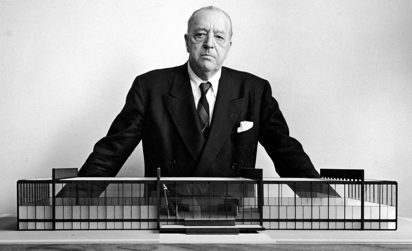
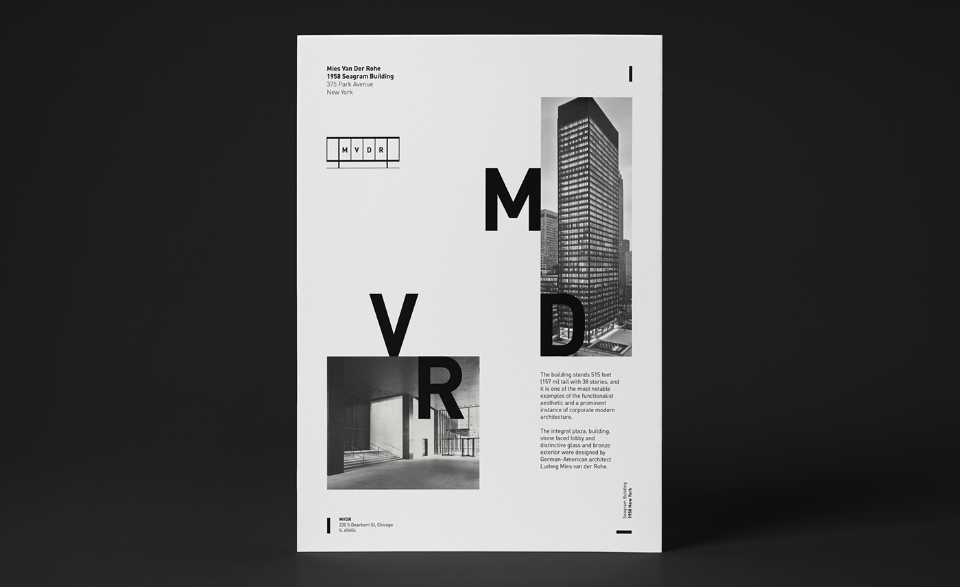
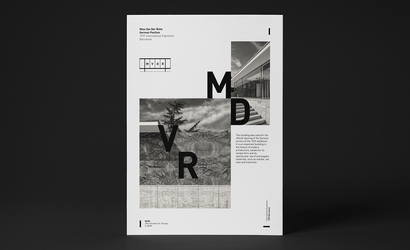
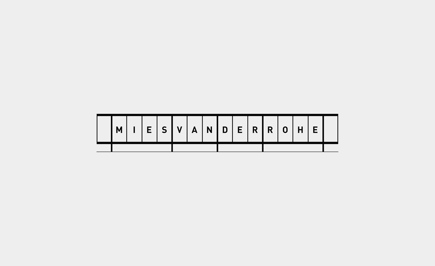
This project arises as a tribute to one of my favourite architects (Mies Van Der Rohe). The idea is to imagine what a brand would look like for such an emblematic and representative architecture firm.
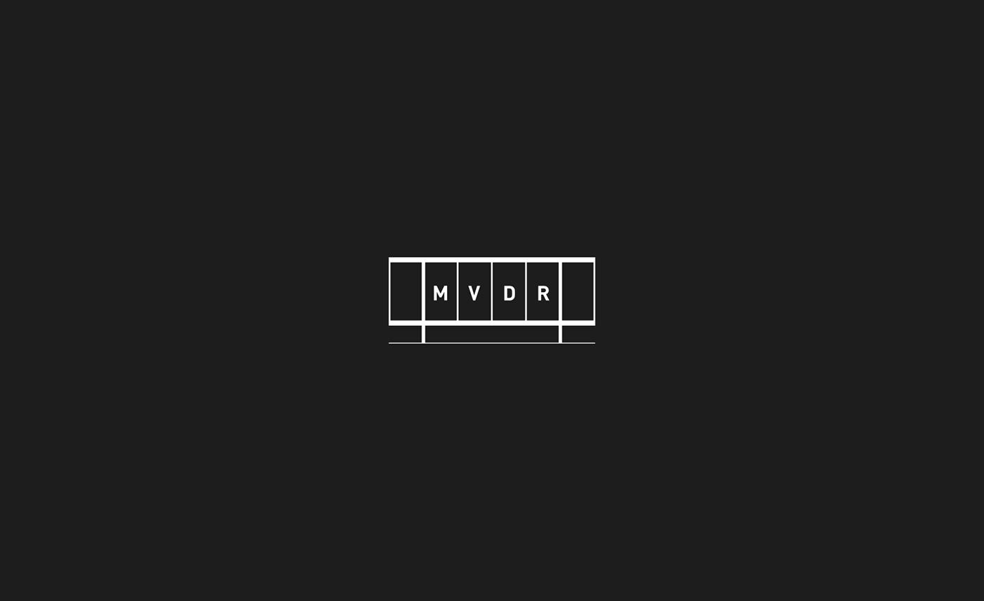
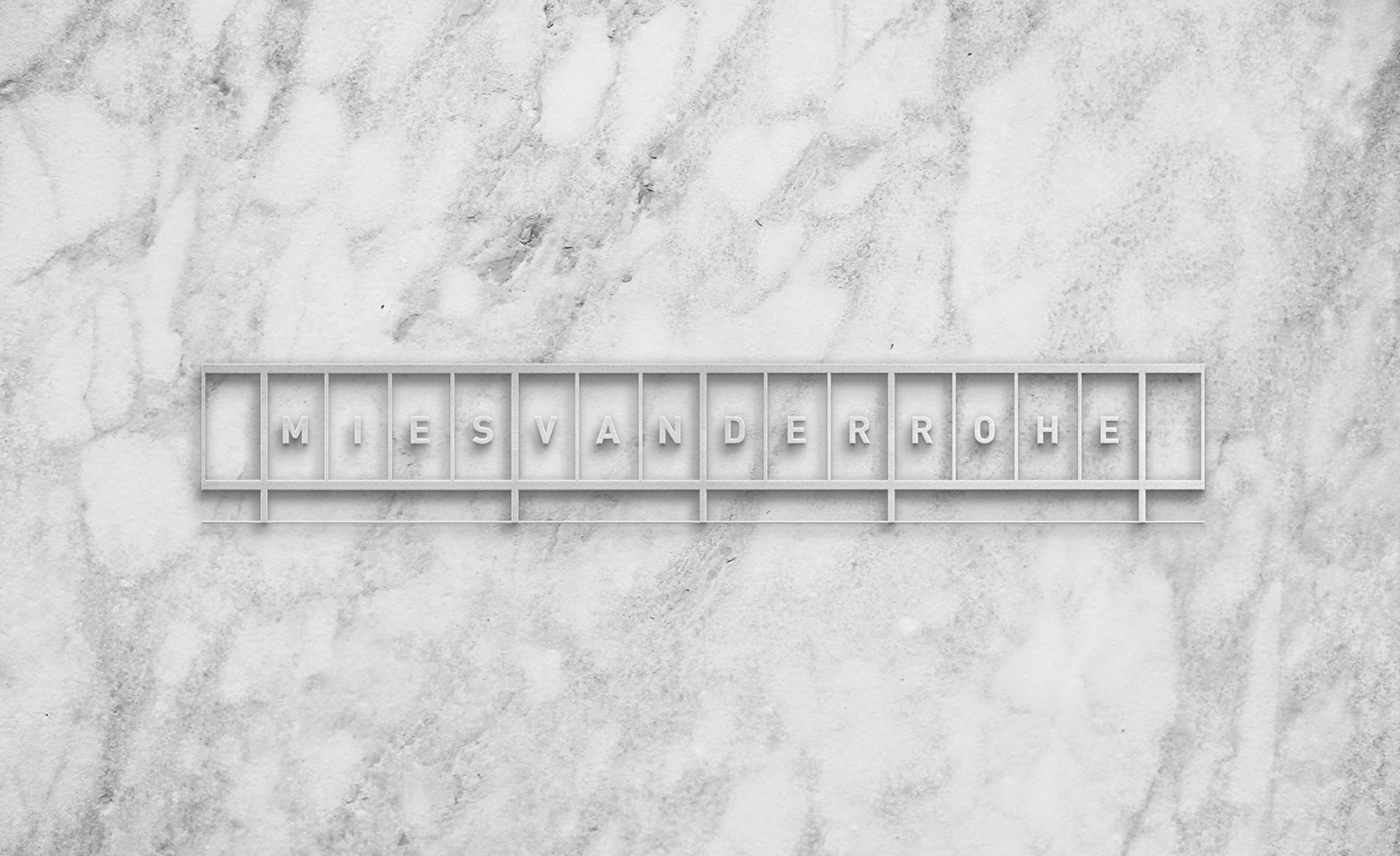
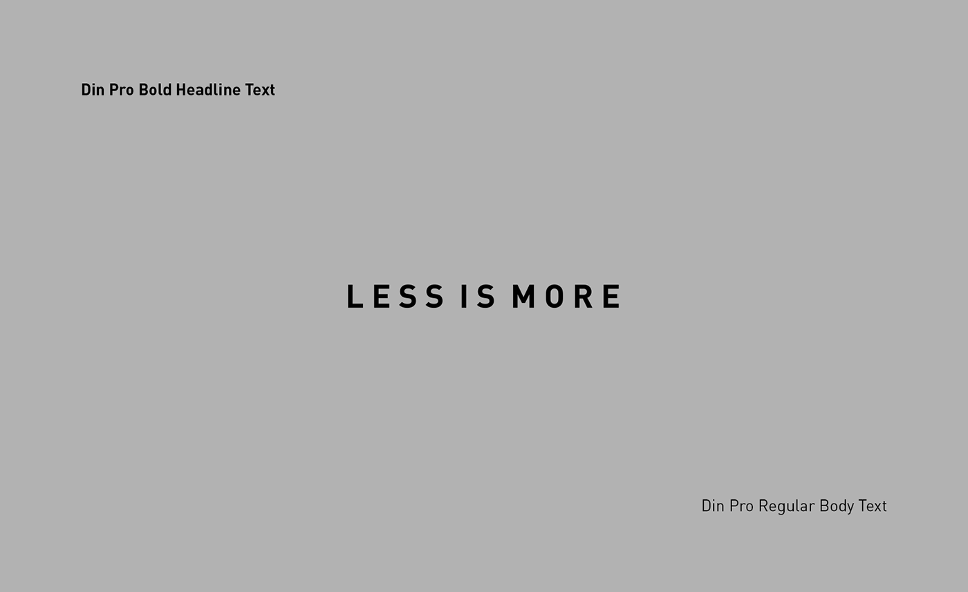
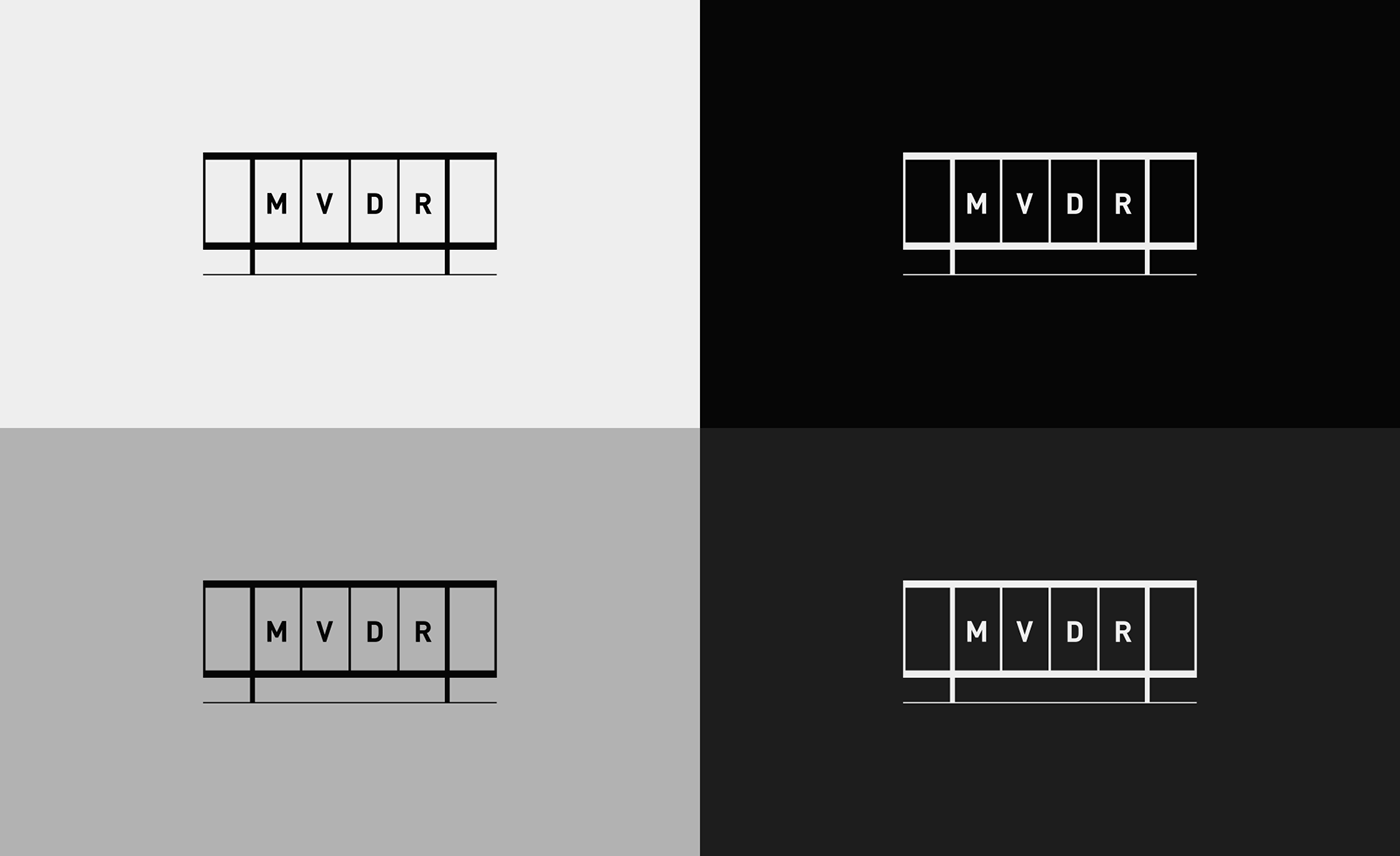
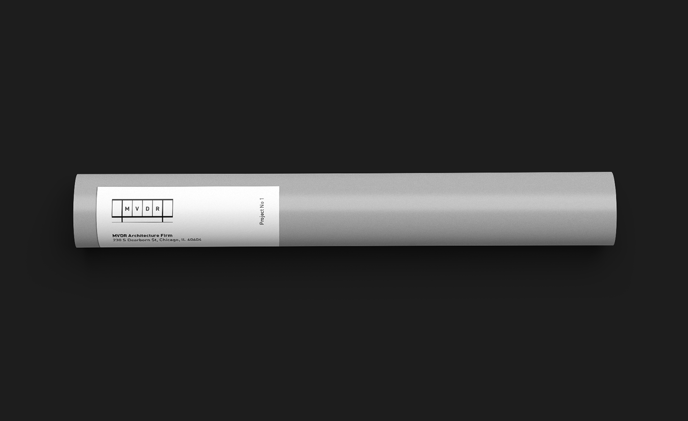
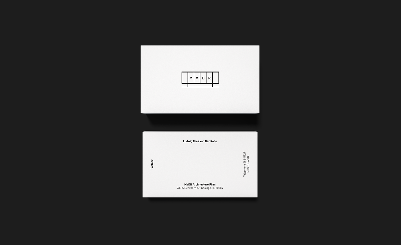
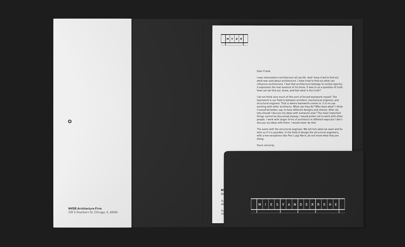
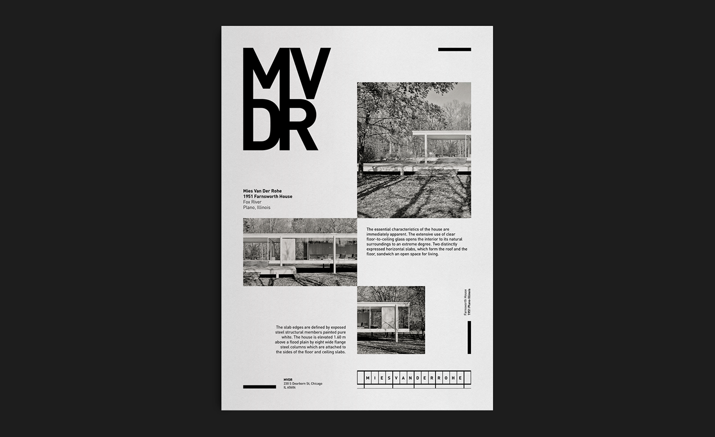
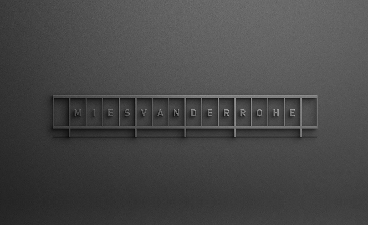
Starting from the premise of the main partner of "less is more", the concept behind this proposal is characterised by the simplicity of the structural elements, the geometric composition and the absence of ornamental elements. The whole system is based on proportions and sobriety. The logo has two versions: a more extended one that contains the full name and a reduced version where only the initials would appear for the cases in which it is more difficult to apply. The color palette consists of three different grays (light, medium, and dark) plus black and white. The typeface used is Din Pro, whose origin is found in the design published in 1931 by the German Institute for Standardisation (Din 1451). It was created primarily for industrial uses and technical drawings. Due to its readability, simplicity, and no frills, it became very popular for general signage use.
Art direction and graphic design: Lucas Gil-Turner
Year: 2020